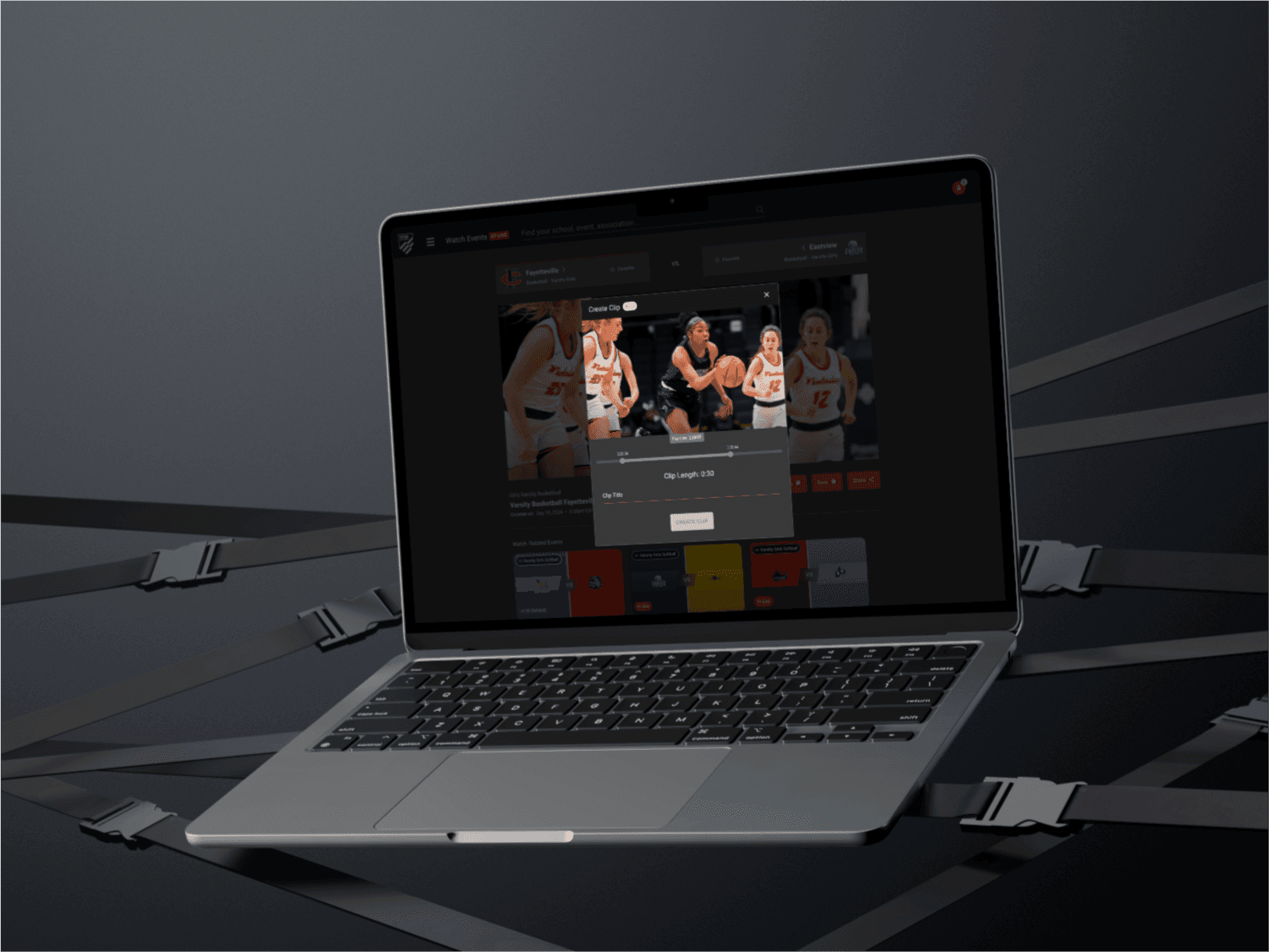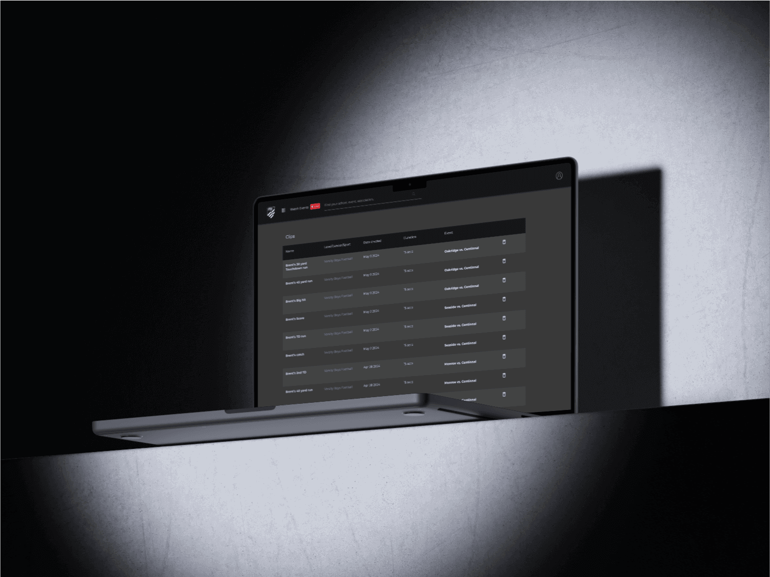

The NFHS Network had an outdated homepage that lacked personalization and an engaging user experience. Collaborating with a senior designer, I helped reimagine the NFHS Network dashboard into the modern, streamlined experience it is today. Additionally, we introduced dark mode to enhance user comfort, especially during late-night viewing sessions. This project is still in progress, with ongoing improvements.
My Approach
The goal was to create a user-friendly dashboard that provided personalized content while also making it easy to navigate between live games, favorite teams, and other features. Working alongside a senior designer, we focused on simplifying the interface while introducing dynamic elements to improve user engagement.
Vision and Innovation
We aimed to turn the NFHS Network dashboard into a hub of personalized sports content. The design took inspiration from modern UI trends, such as minimalism and intuitive navigation, while also incorporating personalized recommendations for live games and upcoming events based on users’ preferences.
Identifying Unique Challenges
One challenge was the cluttered nature of the previous homepage. Users found it hard to locate relevant content quickly. Our goal was to balance user personalization with a simplified navigation experience, ensuring that essential features like live games and team updates were just a click away.
Resolving Complex Problems
A major hurdle was designing a layout that could accommodate both new users without "Your Lineup" content and long-time users with extensive lists of favorite teams and events. We integrated clear, easy-to-use navigation. Introducing dark mode posed technical and design challenges, but we resolved these by ensuring consistent visual hierarchy and usability across both light and dark modes.
User-Centric Design
Throughout the process, we prioritized user needs, creating clear visual distinctions between live games, upcoming events, and favorite teams. The dashboard is now more engaging, with team links easily accessible in the "Your Lineup" section, making it easier for users to find the content that matters most to them.
Meeting User Needs
With a responsive design that works seamlessly across devices, users now enjoy a cohesive experience whether on desktop or mobile. Dark mode was also carefully crafted to reduce eye strain and improve late-night viewing sessions, offering a comfortable and visually appealing alternative to the standard interface.
Detailed Pages and Features
Dashboard: The central hub for users, displaying personalized content such as upcoming games, live events, and favorite teams. The "Your Lineup" section enables easy navigation to team pages and live events.
Live & Upcoming Events: Visually distinct sections that highlight current and future events, ensuring users never miss a game.
Top Highlights: Visually distinct section for top highlights in the country generating user engagement & excitement.
Accessibility and Optimization
The NFHS Network dashboard is fully A11y optimized, ensuring it is accessible to all users. Features include screen reader compatibility, high contrast options in dark mode, and intuitive keyboard navigation. The responsive design ensures a seamless experience across devices, while SEO optimization enhances discoverability. Every element is designed to make the platform accessible and easy to use for all audiences.
Conclusion
By redesigning the NFHS Network dashboard and introducing dark mode, we have transformed the user experience into a dynamic and personalized space. With continued improvements, the dashboard will continue to evolve, offering an even more refined user journey for sports fans.